Ready to use button templates and submenus themes.
In the Themes toolbox you can choose selected buttons and submenu themes for web appearance.
Icon Alignment Codes
Export graphic picture
Using Vista Buttons you can save menu graphic picture as gif-files (*.gif).
DHTML Css Hover Buttons
Search Engine Friendly
Vista Buttons generates html code which is transparent to search spiders.
Navigation Bars For Web
Widest cross-browser compatibility
The html menus generated by Vista Buttons run perfectly on all old and new browsers, including IE5,6,7,8, Firefox, Opera, Safari and Chrome on PC, Mac, and Linux. Vista Buttons menus have a structure based on HTML list of links (LI and UL tags), readable by any search-engine robots and text browsers.
Menu Making For Web Page
Menu Template:
Blue Navigation Bar ButtonsTemplates For Buttons
This menu is generated by Vista Buttons.
Create your own menu now!

Templates For Buttons Screenshots

Menu, Button, and Icon Collection
Vista Buttons provides huge collection of 1400 web buttons, 6600 icons, 300 ready-made samples, so you'll create really nice looking menus and buttons with little or nodesign skills at all! Web 2.0, Mac, iPhone, Aqua buttons, Vista, XP, transparent, round, glossy, metallic, 3d, tab menus, drop down menus will be a breeze!Button and Icon Samples

How to Use Vista Buttons Menu Generator
Properties of play button
This toolbox is for adjusting the buttons' properties. You can adjust one single button or a group of web page buttons selected with Ctrl/Shift keys at once.
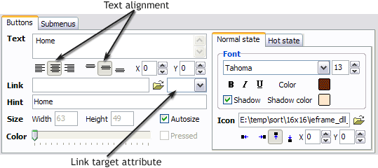 Text - type the button text here. If you want the button to have several lines of text just press "Enter" after typing each line.

Text alignment - defines text alignment inside the button.


Text offset - text offset in relative coordinates. For more precise text position adjustment.
Link - the link that is to be opened when user clicks the button. For example: http://www.vista-buttons.com. You can also click "Open" icon to the left of the "Link" field to select the page you want to link to.
Link target attribute - link behavior adjustment. Link target attribute tells web-browser where to open the linked page. This attribute represents the Target attribute of the link (<a> tag in HTML). You can either enter your target value in the field or choose from the predefined attribute values in the list.
If you enter your own value, it must be a window or a frame name. Note, that names are case-sensitive. The linked document will then be opened in that window/frame.
Predefined attribute values:
_blank - Browser creates a new window for the linked page.
_parent - Linked page replaces the current frame's framesetting page (if one exists; otherwise, it acts like _self).
_self - Linked page replaces the current page in its window or frame.
_top - Linked page is to occupy the entire browser window, replacing any and all framesets that may be loaded (acts like _self if there are no framesets defined in the window)If you leave the field clean then the linked page will be opened in the same browser window.
Hint - specifies the tooltip that is shown when you hold the mouse over the button for a few seconds.
Autosize - defines whether the button size is set automatically to accommodate all its contents or not. If not, you should enter the button size manually in the "Width" and "Height" fields.
Width, Height - if "Autosize" property is off then you can enter the button size in these fields.
Pressed - this property is disabled unless your menu type is "3-state toggle". If the menu type is "3-state toggle" and the property is set then the button will be displayed as pressed. Note, that only one button in the menu can be "pressed" at a time.
In the example below, the "Download" web page buttons Pressed property is set.

Color - move slider to change selected buttons' colors.
- Good navigation is an important step to website success. If people can't find their way around the site, they will quickly give up looking and leave, never to return. So, it's absolute vital that your website has a fast, neat, and
eye-pleasing navigation.
Don't allow your website visitors to get lost. Try Vista Buttons!

Support
Please contact Customer Support at (please include template name in the message title)
FAQ
- ".. However now I'm just wanting to edit the webpage menu itself."
- "..Isn't there a way to insert two different website menus saved as different projects into one webpage at different locations?" Frontpage Web Button Download
- "..As soon as I mouseover an item, I get a broken image icon for my buttons Xp Html."
- "I can add as many levels as I want in the button generate program , but just one submenu button per level in the ..."
- ".. How do I call my custom javaScript with clicked after i have the working HTML export for the go buttons."
- ".. Is there a way to add images to the image collection of the button software?
