
Fonts, Borders and Background Colors
Use any necessary font of any color, size and font decoration for normal and mouseover state. Create any available type, thickness and color of a menu's frame. Choose any color for backgrounds of submenus and items.
Menu Buttons On The Web PageCost Effective
Stop paying month-to-month subscription to web image and icon collections! Don't waste your money on licenses for every new domain where you want to place the menu! Pay once, use for life, anywhere!
Web ButtanPadding and Spacing
Specify various values for padding and spacing for the whole menu and for each separate submenu.
Buttons Download For WebsiteSearch Engine Friendly
Vista Buttons generates html code which is transparent to search spiders.
Transparent Menus XP
Menu Template:
Web Rollover Buttons Green Toolbar


 |  |  |  |  |
Button States
This menu is generated by Vista Buttons.
Create your own menu now!

Button States Screenshots


Menu, Button, and Icon Collection
Vista Buttons provides huge collection of 1400 web buttons, 6600 icons, 300 ready-made samples, so you'll create really nice looking menus and buttons with little or nodesign skills at all! Web 2.0, Mac, iPhone, Aqua buttons, Vista, XP, transparent, round, glossy, metallic, 3d, tab menus, drop down menus will be a breeze!Button and Icon Samples


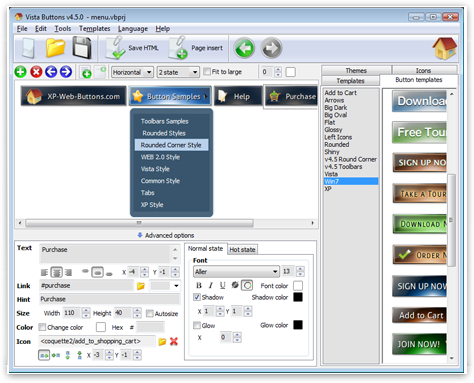
How to Use Vista Buttons Menu Generator
Create buttons in theme editor
To open Theme editor right-click "Tools/Theme editor" in the Main menu. Theme editor helps you create your own themes or modify existing ones. To select a button you would like to edit, just lick it in the Themes toolbox.
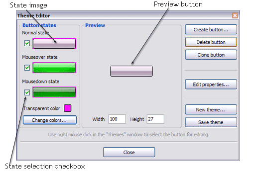
Create button... - to add new button to the current theme. After you click the "Create button" button, the "Create New Button" dialog will appear.
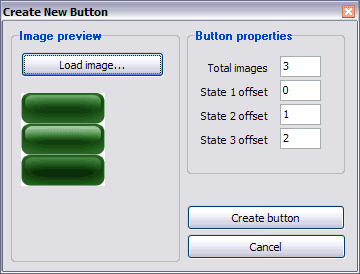
Load image - to open button states image file (*.bmp)
Total images - to define how many button state images are in the opened file. The button states image will then be divided into this number of state images.
State … offset fields - to set the state image for each Normal/Hot state of the button. If you set state offset to 0 then the topmost state image will be used for the state. If you set state offset to 1 then the second state image will be used etc. State 1 corresponds to the Normal state, state 2 - to the Hot state, state 3 - to the Pressed state.
Create button - to add the button to the current theme.
Delete button - to delete the button from the current theme.
Clone button - to create a copy of the button in the current theme.
Edit properties... - to edit the button state images' edge width. After you click the "Edit properties..." button, the "Button properties" toolbox will appear.
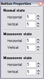
Horizontal and Vertical - to define edge width for each state. Edges are not scaled when you change the button size. Using edges is useful when you would like the button to have border. Then, if the border is within the edges, it won't be scaled.
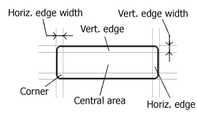
Central area is scaled in both directions. Corners are not scaled. Vertical edges are not scaled in vertical direction. That is, when you change the button height, vertical edges will not be scaled. And vice versa, horizontal edges are not scaled in horizontal direction.
Example: Let's say, we have the following button (size: 50x50):

Let's change it's width to 150:
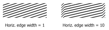
As you can see, in the left image (Horiz. edge width = 1) whole button image was scaled to fit its new size. In the second case (Horiz. edge width = 10) left and right edges of the button were not scaled. Same with the vertical edge width.
Transparent Color - to set the transparent color. When you add new button, transparent color is automatically set to match the color of the top-left corner of the button states image.
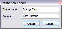
New theme... - to create a new theme. "Create New Theme" dialog will appear, where you should enter theme name and special notices (for example your copyright info, email, etc.).
Save theme - to save theme changes.
Close - to close Theme editor.
Change colors... - to exchange web button images colors. After clicking the "Color exchange" button, the "Color exchange" dialog will appear. Select the state(s) you want to be affected by clicking the checkbox next to the state image.
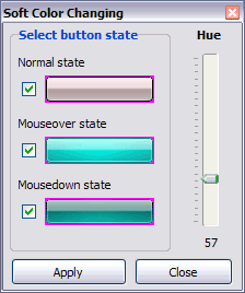
Move slider to find the color you like.
Wight and Height fields - to set the preview button size.- Create 1-state, 2-state, 3-state and 3-state toggle buttons Use images for icons, backgrounds of submenus and items. Using images you can create menus entirely based on graphics. Create both horizontal and vertical menus and submenus with any amount of menus on one page. Insert any HTML code inside the menu item - be it a form or a picture, a flash-object or a text. This ability allows you to create various menus of any complexity.
Support
Please contact Customer Support at (please include template name in the message title)
FAQ
- ".. How do I call my custom javaScript with clicked after i have the working HTML export for the go buttons."
- "..How can I set up Vista Buttons dreamweaver extension?" Next Button Icon
- "..The submenu of a menu buttons do not appear in front of a flash movie, it is allways under it. "
- "..I want the web page navigation bar in the top frame but the sub menus to appear in the bottom frame."
- ".. are you saying the button creater will be able to generate code that will enable my google editor to link into the images"
- ".. I want to clone one of your vista button, make some changes, and save the changed button to a new theme and I'm having trouble figuring out how to do that."
Button States Popular Templates


Button States Recommended by:

Button States Awards


Button States Template of Day
