Save project. Save your image buttons as html
You can save current project in the project file (*.xwb) or into the HTML file (*.html).
Icon Idea Gif Animation
Css Drop Down Menus
Create drop down menus based on css using Vista Buttons. Make various styles for each submenu item adjusting css styles.
HTML Fancy Buttons
Export graphic picture
Using Vista Buttons you can save menu graphic picture as gif-files (*.gif).
Web Buttons For HTML Pages
Overlap all Html Elements on the Page
Submenus drop down over all the objects of the page (select, flash, object, embed).
Gothic Buttons Web
Menu Template:
Horizontal Popup Menu Rounded Toolbar GreenXp Buttons
This menu is generated by Vista Buttons.
Create your own menu now!

Xp Buttons Screenshots

Menu, Button, and Icon Collection
Vista Buttons provides huge collection of 1400 web buttons, 6600 icons, 300 ready-made samples, so you'll create really nice looking menus and buttons with little or nodesign skills at all! Web 2.0, Mac, iPhone, Aqua buttons, Vista, XP, transparent, round, glossy, metallic, 3d, tab menus, drop down menus will be a breeze!Button and Icon Samples

How to Use Vista Buttons Menu Generator
Web buttons and icons properties
This toolbox is for adjusting submenus properties. When you change submenu properties all submenus in the menu will be changed.
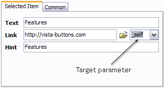

Text - type the submenu's item text here.
Link - the link that is to be opened when user clicks the item. For example: http://www.vista-buttons.com. You can also click "Open" icon to the left of the "Link" field to select the page you want to link to.
Link target attribute - link behavior adjustment. Link target attribute tells web-browser where to open the linked page. This attribute represents the Target attribute of the link (<a> tag in HTML). You can either enter your target value in the field or choose from the predefined attribute values in the list.
If you enter your own value, it must be a window or a frame name. Note, that names are case-sensitive. The linked document will then be opened in that window/frame.
Predefined attribute values:
- _blank - Browser creates a new window for the linked page.
- _parent - Linked page replaces the current frame's framesetting page (if one exists; otherwise, it acts like _self).
- _self - Linked page replaces the current page in its window or frame.
- _top - Linked page is to occupy the entire browser window, replacing any and all framesets that may be loaded (acts like _self if there are no framesets defined in the window)
If you leave the field clean then the linked page will be opened in the same browser window.
Hint - specifies the tooltip that is shown when you hold the mouse over the item for a few seconds.
Padding parameters - If you want to specify padding around the whole submenu you should set Padding parameter. If you want to specify padding around submenu items you should set Items padding parameter.
Border width - Set Border width parameter if you want to specify border around the whole submenu. If you want to specify border width around each submenu's item you should set Items border width parameter.
Border color - set border color around the whole submenu.
Background color - set background for the whole submenu.- Create 1-state, 2-state, 3-state and 3-state toggle buttons Use images for icons, backgrounds of submenus and items. Using images you can create menus entirely based on graphics. Create both horizontal and vertical menus and submenus with any amount of menus on one page. Insert any HTML code inside the menu item - be it a form or a picture, a flash-object or a text. This ability allows you to create various menus of any complexity.

Support
Please contact Customer Support at (please include template name in the message title)
FAQ
- ".. How SEO friendly is the button maker software? "
- "..Please provide step by step instructions on how to create and add a button for a buttons websites menu." XPstyle Css Buttons
- ".. How do I call my custom javaScript with clicked after i have the working HTML export for the go buttons."
- ".. are you saying the button creater will be able to generate code that will enable my google editor to link into the images"
- "..I want the web page navigation bar in the top frame but the sub menus to appear in the bottom frame."
- ".. However now I'm just wanting to edit the webpage menu itself."
