Create your own button themes
Theme editor helps you create your own themes or modify existing ones.
Insert Button Download Gif
Size
You can set the size of the menu in pixels.
Frontpage Dropdown Buttons
Button State
You can create 1-state, 2-state, 3-state and 3-state toggle buttons using Vista Buttons. 1-state buttons are simple static image buttons. 2-state buttons respond to mouseOver event creating rollover effect. Mouse click doesn't change the button appearance. 3-state buttons support both mouseOver and mouseClick event. 3-state toggle buttons additionally stick in the pressed state after a click.
Standard Windows Buttons Download Clipart
Easy to Use
With Vista Web Buttons clear and comprehensible interface, you need just 4 simple steps to get your web buttons or html menu ready and if you use a pre-designed sample as a base you'll end up even faster!
Frontpage Insert Navigation Buttons
Menu Template:
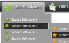
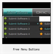
Cascading Menu Blue Glossy - RoundedFree Menu Buttons
This menu is generated by Vista Buttons.
Create your own menu now!

Free Menu Buttons Screenshots

Menu, Button, and Icon Collection
Vista Buttons provides huge collection of 1400 web buttons, 6600 icons, 300 ready-made samples, so you'll create really nice looking menus and buttons with little or nodesign skills at all! Web 2.0, Mac, iPhone, Aqua buttons, Vista, XP, transparent, round, glossy, metallic, 3d, tab menus, drop down menus will be a breeze!Button and Icon Samples

How to Use Vista Buttons Menu Generator
1) File menu
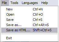
New - to create new project.
Open - to open saved project. You will be asked if you would like to save the current project in the menu buttons creator.
Save - to save current project in the project file (*.xwb). When you save to project file, the directory "ProjectName.xwb.icons" is created, where ProjectName is the name of your project file. This directory contains button icons, .css and .js files of the saved menu.
Save as… - to save current project in the project file (*.xwb) or in the HTML file or to save your project under another name. Choose type from the "File type" list in the "Save as…" dialog and enter project's (new) name. When you save to project file, the directory "ProjectName.xwb.icons" is created, where ProjectName is the name of your project file. This directory contains button icons, .css and .js files of the saved menu. If the menu doesn't have any icons then the directory is not created.
Save as HTML - to save current project into the HTML file (*.html). Project HTML file will be saved then, and the directory created, containing buttons' images. The directory name will be: "YourProjectName-files", where YourProjectName is the name of the HTML file saved. For example: if you enter "Header" in the "Name" field of the "Save as…" dialog, then "Header.html" and directory named "Header-files" will be created.
Exit - to close Vista Buttons application.
2) Tools
Export images - to save menu buttons' images as gif-files (*.gif), png-files (*.png) or jpg-files (*.jpg). "Save As…" dialog will appear, where you can either type each button name or leave it unchanged. If you want to save the button images, press "Save". "Save settings" dialog will appear where you can choose image format. Either way (if you don't want the button images to be saved), press "Cancel". This procedure will be repeated for all the menu buttons. When you press "Save", 1 to 3 images are to be saved, depending on the menu type. Their names will be: ButtonName_0.gif - ButtonName_2.gif, where ButtonName is the name you have entered when saving.
- ButtonName_0 - corresponds to Normal state.
- ButtonName_1 - Hot state image.
- ButtonName_2 - corresponds to pressed/clicked state.
Theme editor - to edit/create new themes.
Page insert - you can insert your menu into the existing HTML page.3) Languages menu

The "Languages" menu contains the list of available interface languages. English is the default language setting.
4) Help menu

Help - to read the help.
About -show information about Vista Buttons.- Create 1-state, 2-state, 3-state and 3-state toggle buttons Use images for icons, backgrounds of submenus and items. Using images you can create menus entirely based on graphics. Create both horizontal and vertical menus and submenus with any amount of menus on one page. Insert any HTML code inside the menu item - be it a form or a picture, a flash-object or a text. This ability allows you to create various menus of any complexity.

Support
Please contact Customer Support at (please include template name in the message title)
FAQ
- "..How do I make the sub-menu backgrounds non-transparent so that web page text that is behind the sub-menus when the website menus open does not appear?"
- "..The submenu of a menu buttons do not appear in front of a flash movie, it is allways under it. " Website Buttons And Navigation
- "..I want the web page navigation bar in the top frame but the sub menus to appear in the bottom frame."
- "..Isn't there a way to insert two different website menus saved as different projects into one webpage at different locations?"
- ".. Is there a way to add images to the image collection of the button software?
- ".. I want to clone one of your vista button, make some changes, and save the changed button to a new theme and I'm having trouble figuring out how to do that."
