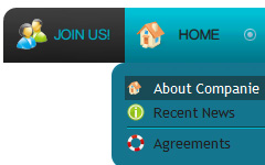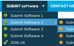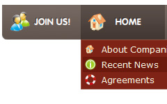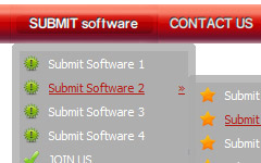
High Quality and Professional Results
You don't have to know HTML, JavaScript, CSS or any other coding languages to make multi-state rollover web buttons, professional cross-browser, search engine friendly DHTML menus. All you have to do is make some clicks and adjust buttons as you wish for them to appear. Vista Web Buttons will generate all necessary images, html, javascripts, css styles automatically!
Windows XP Nav Bars
Integration with popular web authoring software.
Vista Buttons integrates with Dreamweaver, FrontPage, and Expression Web as an extension/add-in. Create, insert, modify a menu without leaving your favorite web design framework!
Programmin
Padding and Spacing
Specify various values for padding and spacing for the whole menu and for each separate submenu.
Cool HTML Navigation Styles
Cost Effective
Stop paying month-to-month subscription to web image and icon collections! Don't waste your money on licenses for every new domain where you want to place the menu! Pay once, use for life, anywhere!
Navigation Bar And Button
Menu Template:
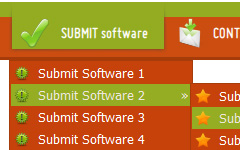
Red Slide Down MenuButton Templates
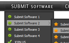
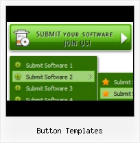
This menu is generated by Vista Buttons.
Create your own menu now!

Button Templates Screenshots

Menu, Button, and Icon Collection
Vista Buttons provides huge collection of 1400 web buttons, 6600 icons, 300 ready-made samples, so you'll create really nice looking menus and buttons with little or nodesign skills at all! Web 2.0, Mac, iPhone, Aqua buttons, Vista, XP, transparent, round, glossy, metallic, 3d, tab menus, drop down menus will be a breeze!Button and Icon Samples

How to Use Vista Buttons Menu Generator
- Let's assign text to the subitems. Select first item in the submenu by clicking it and then enter text in the "Text" field on the Properties toolbox. You will see that, as you enter the text, the selected submenu's text will change too.
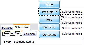
Then select next item in the submenu with click. Enter its text and so on. After finishing, the menu will look like this: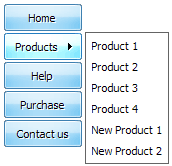
- Let's change the submenu theme. To do it just select theme you like in the submenus themes list on the Themes toolbox. Then you can browse this theme's submenu backgrounds. Note, that submenu backgrounds are previewable. You can look at their behavior while choosing. Just point mouse at it to know how submenu will react.
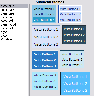
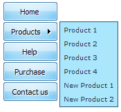
When you find a submenu background you like, double-click it to apply. For example, after choosing one of the "blue" theme's backgrounds, we'll get following results:
- Now let's add some icons. Select submenu item and then click the "Open icon" button on the "Selected Item" tab of the "Submenus" toolbox.

"Open" dialog will appear, where you can choose an icon. Other way to assign an icon is to type its full path and name in the "Icon" field ("c:\myicons\stylish_3\pretty.ico", for example). Repeat this for each submenu item. You should get something like this in result: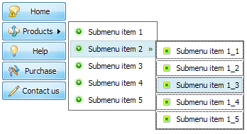
- Apply any font of any color, size and font decoration you need. Use any available type, color and thickness of a menu's frame. Choose any color for submenus and items backgrounds. Specify various values for spacing and padding for the whole menu and for each separate submenu. Create separators using your own pictures, size and alignment.

Support
Please contact Customer Support at (please include template name in the message title)
FAQ
- ".. Can site buttons be added to my existing web pages and how easy is it to update once it is installed and do? "
- ".. How SEO friendly is the button maker software? " Web Buttons For XP
- ".. I want to clone one of your vista button, make some changes, and save the changed button to a new theme and I'm having trouble figuring out how to do that."
- "..How do I make the sub-menu backgrounds non-transparent so that web page text that is behind the sub-menus when the website menus open does not appear?"
- "I can add as many levels as I want in the button generate program , but just one submenu button per level in the ..."
- "..Can I set the pressed state of a javascript Vista Buttons after the page loads?"
